StreetsofBeige
Gold Member
Terrible logo. The cut off quotation part looks bad. And the tagline is barely coherent.
Last edited:
10x better.I've got a better design


To be more inclusive, its fun for ALL after all. Or so it seemswhy is it pink
I love that logoWhat a let down, I always liked to think of the old logo as a red bell pepper lying on top of a lemon, but the lemon is a big girl the bell pepper has been feeding. Tell me I'm wrong:
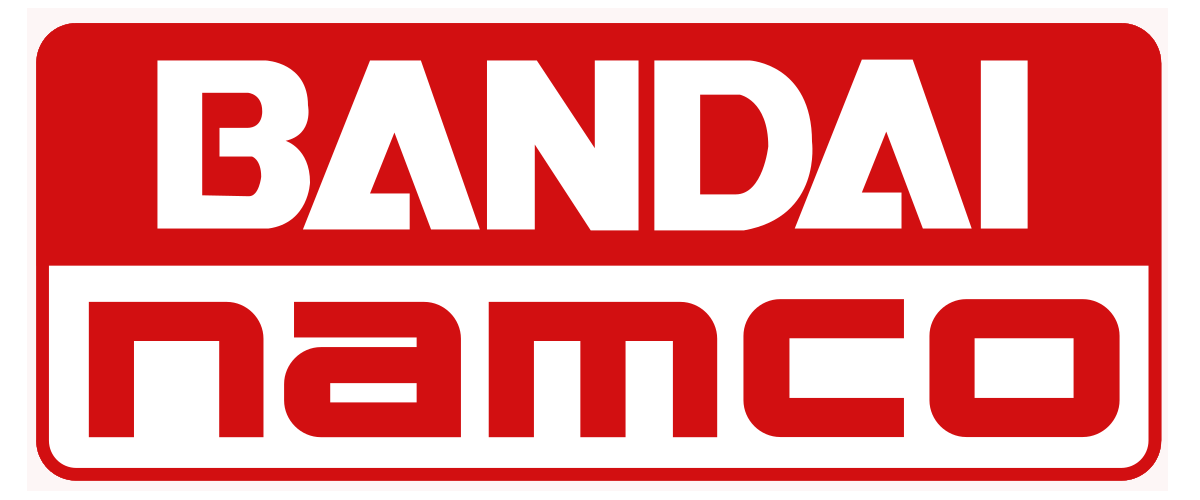
:format(webp)/cdn.vox-cdn.com/uploads/chorus_image/image/69938044/bandai_namco_logo_2.0.jpg)
You mean the shitty era when Bandai bought Namco and churned out a bunch of mediocre anime games and milked Dark Souls?End of an era.
New logo looks a bit soul-less, imo.
 www.videogameschronicle.com
What a let down, I always liked to think of the old logo as a red bell pepper lying on top of a lemon, but the lemon is a big girl the bell pepper has been feeding. Tell me I'm wrong:
End of an era.


Man, there was a "Bandai Namco Era"? I guess so. Seems like I'm just old, but I'm still getting over when they were kind of wobbling about whether they're "Bandai Namco" or "Namco Bandai" or two separate subcompanies called "Bandai" and "Namco" or...


(I still have to correct myself from saying "Namco Bandai" sometimes when talking about Tekken or RR, by accident or otherwise...)
In these days and ages, the new logo should be more like that:
Or
Anyway, the 80´s logo still rocks!

it's good for slapping a $19.99 price on.As a graphic designer, this logo is boring and just seems like a generic one that you would see for a monthly magazine piece.
That logo was great in 1982Not a fan of the "name inside a circle" Design language of logos today.
Just look at Electronic Arts pre-2000 one. What was wrong with that?

I also bet some design studio got paid 7 digits+ in order to come up with it. Money which could be been spent on actually relevant stuff.