• Hey, guest user. Hope you're enjoying NeoGAF! Have you considered registering for an account? Come join us and add your take to the daily discourse.

Danganronpa creators are “risking their lives” for their new game, which has put them in debt

20240619-32662-header-960x640.jpg


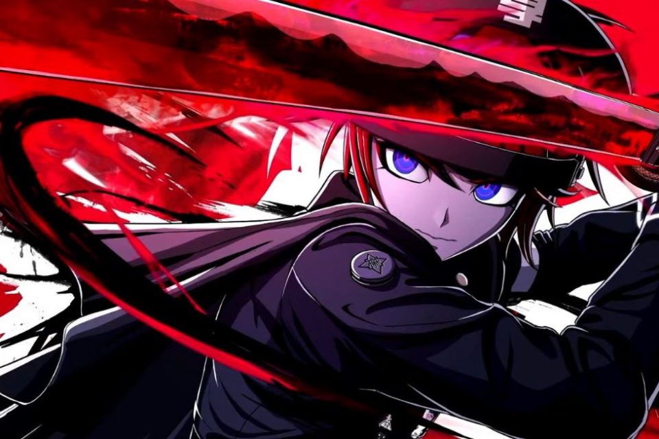
The June 18 Nintendo Direct broadcast unveiled Too Kyoo Game’s brand-new RPG The Hundred Line: Last Defense Academy. The long-awaited collaboration between Danganronpa series writer Kazutaka Kodaka and Zero Escape creator Kotaro Uchikoshi is set to be published in early 2025 by Aniplex. The despair-filled game’s announcement has been met with an overwhelming response from fans of both creators, but it seems the project had a rather rocky start, as revealed by Kodaka.

In a recent interview with Famitsu, Kodaka, who is the director and scenario writer for The Hundred Line: Last Defense Academy, reveals that development of the title started 6-7 years ago, right after Too Kyoo Games was established. The game was initially supposed to be published by another major publisher, but the project went through “numerous difficulties” and ultimately fell through.

20240619-32662-001.jpg


But despite the initial project for Kodaka and Uchikoshi’s game reaching a complete halt, the creators were confident in what they were making and decided to restart development on their own, keeping the core concept but revamping characters and other elements. According to Kodaka, the team planned to make Hundred Line an “indie-scale game,” but as the title’s concept, characters and scenario solidified, they realized that they would not be able to create their ideal game without expanding the scale of development. “We decided to take the plunge and…take out a loan,” Kodaka recalls.


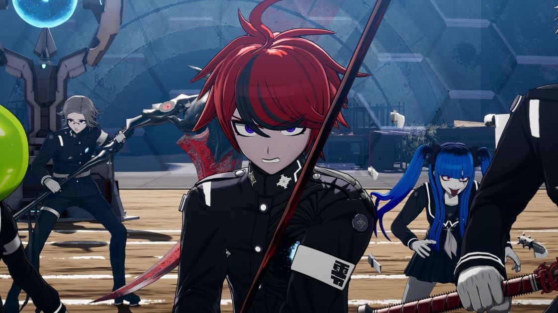
Even if Too Kyoo Game’s members had sold their shares and invested all the money they owned, this would not have been enough to secure the capital needed for Hundred Line’s development, which ultimately led to them going into debt. But fortunately, the developers were able to find a publisher willing to work with them even if they were in debt – Aniplex. In addition, they secured the cooperation of developers Media.Vision and Jet Studio, the former of which is working on the game’s simulator/RPG elements.

Through laugher, Kodaka notes that Too Kyoo Games is still in debt because of The Hundred Line: Last Defense Academy, and that the members are “risking their lives” for the game. “It was tough both financially and mentally, but I may never have another opportunity to put this much effort into a project,” Kodaka comments while noting that whole ordeal was a great experience for him.

20240619-32662-002.jpg


The Hundred Line: Last Defense Academy, Too Kyoo Games’ first in-house IP, is set to be released in early 2025 for the PC (Steam) and Nintendo Switch.

Source - Automaton West
 

cireza

Member
This here...
20240619-32662-002.jpg

...drives me insane.

Developers have a window that is as large and the entire screen, yet they stretch the letters to the point they look bad, wasting 30 or 40% of the available space.
And on top of this, it isn't even Variable Width Font. I mean, I have implemented VWF on Game Gear/Master System, 8 bits tile-based consoles. How come we can't even do this nowadays is beyond me.
 
Last edited:

Arsic

Loves his juicy stink trail scent
Well rip their studio then.

I don’t see this appealing more than to their already established core audience.

The combat doesn’t do anything for me so there isn’t a new gameplay pull.
 

TintoConCasera

I bought a sex doll, but I keep it inflated 100% of the time and use it like a regular wife
This here...
20240619-32662-002.jpg

...drives me insane.

Developers have a window that is as large and the entire screen, yet they stretch the letters to the point they look bad, wasting 30 or 40% of the available space.
And on top of this, it isn't even Variable Width Font. I mean, I have implemented VWF on Game Gear/Master System, 8 bits tile-based consoles. How come we can't even do this nowadays is beyond me.
The font looks kinda bad yeah, but having all that padding on the left and right is the right decision. Makes reading much more comfortable, otherwise you have to move your eyes from one side to the screen to the other all the time, which is very tiresome specially in text-heavy games.
 

Northeastmonk

Gold Member
The strategic gameplay looks fun. I tried Danganronpa but it didn’t have me hooked. Going into debt assuming you’re going to sell enough copies to pay back your debt? I support their dream to make this project. It sucks they had to go into debt to do it. I hope it pays off.
 

cireza

Member
The font looks kinda bad yeah, but having all that padding on the left and right is the right decision. Makes reading much more comfortable, otherwise you have to move your eyes from one side to the screen to the other all the time, which is very tiresome specially in text-heavy games.
I disagree. I have complete Witch on the Holy Night recently and using the entirety of the screen is the way to go, with nice, round letters, for maximum readability from sitting far away from the screen.

With text like this, I know for sure I will have to sit at the edge and lean forward to be able to read it properly.

Proper use of space, variable width font, nice easy to read letters :
zp-94651_Lightning-Returns-Final-Fantasy-XIII_2013_10-28-13_003.jpg


Same here :
47da76848b59c1f0fb27dd1b694d25ed102a00492510c280edc91d22e02c1b18


And here...
qegzypk0pgqmkqa8jbsa.webp


The guys doing this :
20240619-32662-002.jpg

can go back and take UX design classes. Everything is bad about it, letters aren't even scaled evenly. This is pretty much zero effort, but it is very common nowadays, for sure. The fact that this is a common practice doesn't make it acceptable though. Not going to spend hours reading text presented like this.
 
Last edited:

TintoConCasera

I bought a sex doll, but I keep it inflated 100% of the time and use it like a regular wife
Proper use of space, variable width font, nice easy to read letters :
zp-94651_Lightning-Returns-Final-Fantasy-XIII_2013_10-28-13_003.jpg


And here...
qegzypk0pgqmkqa8jbsa.webp
But those examples you posted do have padding on the sides. Sorry but, am I missing something?

I was talking only about the padding, already said that I agree that the letters look ugly.
 

cireza

Member
But those examples you posted do have padding on the sides. Sorry but, am I missing something?
Oh come on, you can't see the difference between a small gap to the border and maybe 40% of wasted space ? lol.

And don't draw a window if you are not going to fill it entirely, makes zero sense. This is the perfect example of a hud design that was done for another language, that most probably filled the space with characters, and wasn't changed during localization, with letters being crushed to make sure it always fit in the space. While Variable Width Font is meant to address these issues to begin with.
 
Last edited:

TintoConCasera

I bought a sex doll, but I keep it inflated 100% of the time and use it like a regular wife
Oh come on, you can't see the difference between a small gap to the border and maybe 40% of wasted space ? lol.
You caught me editing my previous post, sorry.

Here, have an example of what I think is a very badly done textbox:

501bda3136590a972dc4e667b712a407f4e2c4e8_2_690x431.png


The text is barely separated from the edges of the screen, so you'll be constantly moving your eyes to one edge of the screen to the other. I think this is criminal in 16:9 games.

Simple-Choice-Dialogue-menu-in-The-Legend-of-Zelda-Breath-of-the-Wild-Nintendo-2017.ppm


Here's a much better one. The text is centered on the screen, 100 times more comfortable to read.

And I don't think this is wasted space at all.
 
Last edited:

cireza

Member
You caught me editing my previous post, sorry.

Here, have an example of what I think is a very badly done textbox:

501bda3136590a972dc4e667b712a407f4e2c4e8_2_690x431.png


The text is barely separated from the edges of the screen, so you'll be constantly moving your eyes to one edge of the screen to the other. I think this is criminal in 16:9 games.

Simple-Choice-Dialogue-menu-in-The-Legend-of-Zelda-Breath-of-the-Wild-Nintendo-2017.ppm


Here's a much better one. The text is centered on the screen, 100 times more comfortable to read.

And I don't think this is wasted space at all.
For Zelda there is nothing that prevents them to make letters bigger. But anyway, if you are going to display 9 words, for sure, you don't need the entirety of the screen length. And the window size is properly adapted to the overall length of the text.

The first game needs some padding of course. But maybe it was done by a single guy or whatever. Here we are talking about teams of professionals doing zero effort.
 
Last edited:

TintoConCasera

I bought a sex doll, but I keep it inflated 100% of the time and use it like a regular wife
For Zelda there is nothing that prevents them to make letters bigger. But anyway, if you are going to display 9 words, for sure, you don't need the entirety of the screen length. And the window size is properly adapted to the overall length of the text.

The first game needs some padding of course. But maybe it was done by a single guy or whatever. Here we are talking about teams of professionals doing zero effort.
All I'm saying is that not only it's fine, but it's good design to not have the text take most of the width of the screen on a 16:9 game.
 
Last edited:

NanaMiku

Member
Well, they make too many games at once. They released their two first games almost at the same time. Not just that, they also made some anime
 
Can their artists and designers at least try to come up with something what doesn't look like danganronpa copy?
Raincode, while instantly recognizable as being directed by the Danganronpa artist (Rui Komatsuzaki), had its own style (purple and green neon bathed futurism, hybrid london/japan architecture, persistent rain). Rain Code was clearly made with many of the same principle creators as Danganronpa but was nevertheless distinct from DR.

NSwitch_MasterDetectiveArchivesRainCode_07.jpg


Unfortunately this new game visually looks like it could just be a new Danganronpa game. which is not what I was expecting from the first 50//50 collab between Kodaka and Uchikoshi. Almost none of Uchikoshi's signature flare is recognizable, at least from this trailer. I'll have to wait and see more before I'm convinced.
 

ReyBrujo

Member
This here...
20240619-32662-002.jpg

...drives me insane.

Developers have a window that is as large and the entire screen, yet they stretch the letters to the point they look bad, wasting 30 or 40% of the available space.
And on top of this, it isn't even Variable Width Font. I mean, I have implemented VWF on Game Gear/Master System, 8 bits tile-based consoles. How come we can't even do this nowadays is beyond me.

As someone who is far sighted it drives me crazy when games in Switch have small fonts. I had to drop God Eater 3 because the font was absurdly small with insanely large menues and options. And that's why I love NIS games, because they use huge fonts. So I should say I don't mind this font. Could be better, true, but it's far better than straight PC ports (Wizardry is another with a minuscule font but it's a dungeon crawler and I'm fan of them, otherwise I'd have dropped it as well).
 
Last edited:

Shut0wen

Member
Oh please. Cry me a river. Vanillaware have been almost bankrupting themselves every game they make since almost the beginning. These guys need to toughen up a bit
Not really, sega gives them a budget and they use it all up, quite different to bankrupting yourself
 

Nydius

Gold Member
I commend their passion and dedication to their project but I buy games based on whether they appeal to me and look like they’d be enjoyable. The developers financially overextending themselves doesn’t really factor into my purchase decision. I’m not going to “pity buy” a game that may not interest me.
 
Top Bottom