• Hey, guest user. Hope you're enjoying NeoGAF! Have you considered registering for an account? Come join us and add your take to the daily discourse.

Microsoft’s new Xbox Home UI is getting reworked after complaints over ‘crowded’ backgrounds

Kvally

Banned
That's what always strikes me compared to the PS dashboards. On the Xbox even if you're a paying subscriber you still have the ads in your face on the main page when you launch the console.
It’s even worse on PS5. It defaults to the Explore tab and it’s one full page ad. Sometimes it has some way crazy unrelated crap 💩 on it. Just allow me to disable it.
 
Seems fine to me. Though I guess the tiles themselves could be much smaller. It would make it look more neat and less cluttered. Sony have rhe right idea. Well apart from changing the home button but I got used to it
 

diffusionx

Gold Member
MS has had UI design experience for decades, they've spent untold amounts of time and money and experience studying this, yet they have not been able to figure out the Xbox interface for 2 gens now. It is weird. I remember when I got my PS4 and booted it up, using it was a breath of fresh air compared to One. The concept in the OP is just the PS4/5 UI with stuff moved to the bottom. Which, by the way, MS should do, even if it might be embarrassing to them and an admission of defeat.
 
Last edited:

ZoukGalaxy

Member
XBOX UI is a shame mess: bring back the efficient XBOX 360 UI and put your tiles and ads deep in your a**

Microsoft and Google are really the worst: constantly changing UI for the sake of the change, like W11: let's making productivity dead and fill giant empty space.
 

DaGwaphics

Member
I do not understand ppl wanting to see wallpapers.

The only thing that I hate, is that the apps and games would stick to one grid on the main page, I would love to see them in separate raws

PS On my phone, tablet, Mac, PC a have solid black background)

Agreed. The point is to be able to navigate as quickly as possible. Why on earth do I need 80% of the screen to be a picture that I have to scroll past to get to anything. 🤷‍♂️

People like to sit and look at their wallpaper I guess.
 
Last edited:

Nydius

Member
Blades and XMB. Simple and easy to use.

michael fassbender perfection GIF
Completely agree. All they needed to do was refine the blades for bigger displays. Every “new ui experience” they’ve pushed to Xbox has been awful.

First the new avatars with big rounded rectangles that wasted like 70% of screen space on nothing. Then they got obsessed with Metro UI’s flat squares and and wanted to put it on everything: Windows, Phone, Xbox.

The Xbox UI now is a fucked up mashup of pull out menus and left over Metro UI squares with a ton of advertisements and other junk. They finally abandoned these big clunky Metro inspired squares with Windows 11 and it would be very nice if they’d do the same on the Xbox UI.
 

NeonGhost

uses 'M$' - What year is it? Not 2002.
It’s even worse on PS5. It defaults to the Explore tab and it’s one full page ad. Sometimes it has some way crazy unrelated crap 💩 on it. Just allow me to disable it.
At least it’s always PlayStation/video game related on Xbox you get ads for what ever virtue signaling month it is ad and please don’t say hurtful things while playing online message ad
 

kiphalfton

Member
Well have it like 99% other UI's, and have it where it looks like it was designed with toddlers or 90 year olds in mind, and the icons are ginormous.

I'm being sarcastic.

Go back to condensed down design, where you can fit more than one icon or thumbnail on the screen at once, without retarded backgrounds
 
Last edited:

Kvally

Banned
At least it’s always PlayStation/video game related on Xbox you get ads for what ever virtue signaling month it is ad and please don’t say hurtful things while playing online message ad
Xbox ads suck. PS5 is worse. One time I turned it on and it was some product promotion. I was like, really?

They both need to allow us to disable the ads as well as the default Explore ad tab.
 

Kvally

Banned
MS has had UI design experience for decades, they've spent untold amounts of time and money and experience studying this, yet they have not been able to figure out the Xbox interface for 2 gens now. It is weird. I remember when I got my PS4 and booted it up, using it was a breath of fresh air compared to One. The concept in the OP is just the PS4/5 UI with stuff moved to the bottom. Which, by the way, MS should do, even if it might be embarrassing to them and an admission of defeat.
I gave up on the home page. I just use the guide button. Way fast, no ads, and easier access to everything.

Going the route of the PS5 would also be bad.
 

phant0m

Member
Blades or XMB
We dont need to reinvent already perfect UIs...
1000%

I don't know why the fuck this is so hard for Microsoft, other than there's some internal mandate that 40% of the screen must be Ads. Blades still the GOAT console UI. PS4/PS5 UI is basically a natural evolution of XMB, though with PS5 It started getting a liiiiiiittle too busy with the added stuff along the bottom but at least it's customizable.

Here you go, this one's on me:

  • Blade 1: Games. 3 most recently played games are on a top row with larger "live" tiles with the rest of the library continuing below. Allow users to organize into folders.
  • Blade 2: Media. Same as games, but all streaming media apps
  • Blade 3: Store. The blade IS the store, don't open another fucking "app" that actually shows the store. Place your "you might be interested in..." ads here.
  • Blade 4: Xbox Live. All the party management, friends, sharing, activity feeds, etc go here.
  • Blade 5: Game Pass. Browse, stream, and install games from GP.
Allow users to re-order the blades to their choice. Allow users to hide any blade they don't want to see.

Bonus: Make/sell themes, including an in-house "OG Xbox" and "Xbox 360" theme/style
 
Last edited:

Xcell Miguel

Gold Member
It got reworked and looks quite good.
There's still ads but more games are shown, background is more visible and shortcuts at the top, plus the background changes depending on the game being hovered.


0501-New-Dashboard-experiment_Top-of-Home-FINAL-72653034f196251c18d6.png


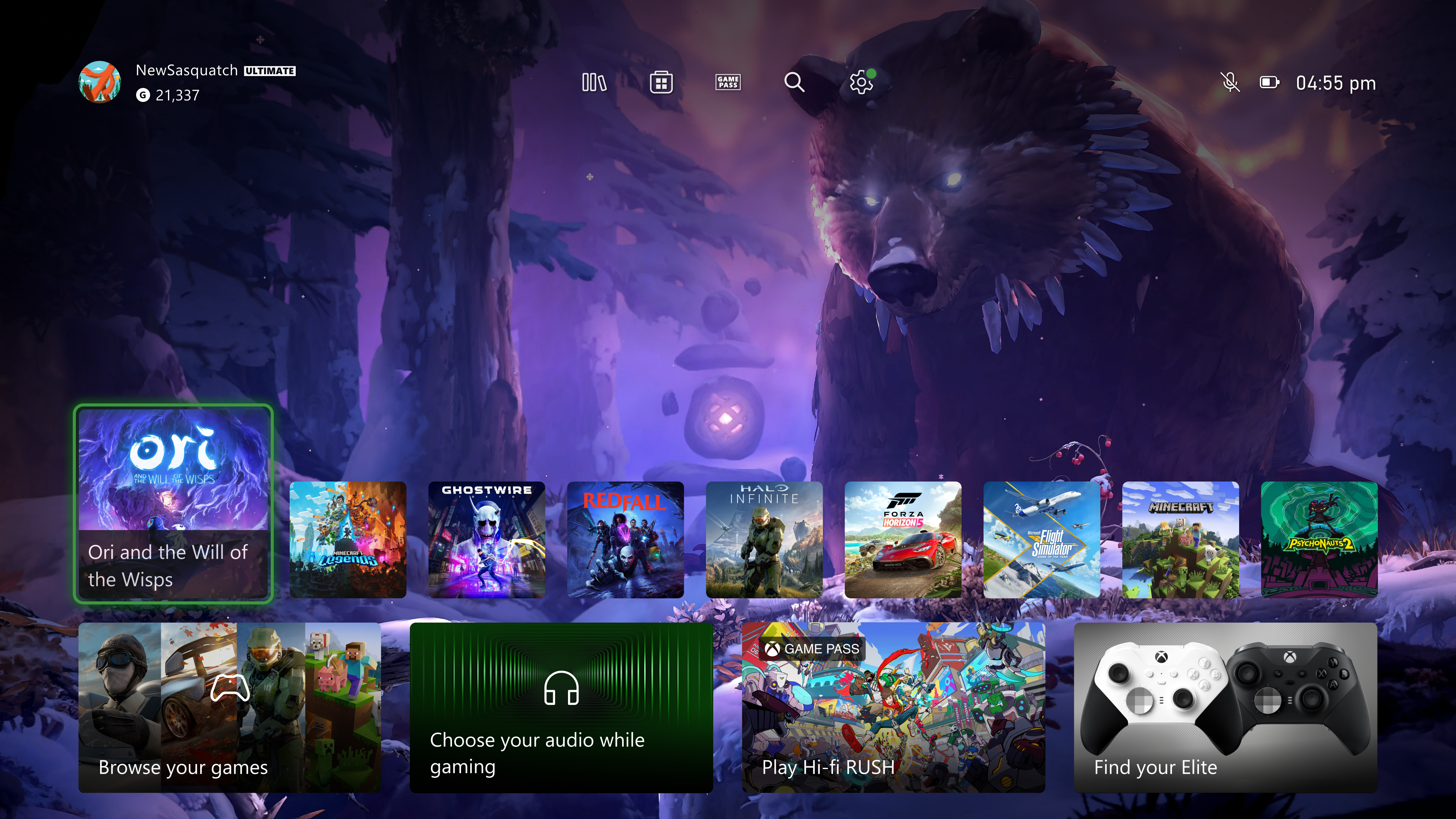
This new version of Home:
  1. Provides easy navigation to your library, the Microsoft Store, Xbox Game Pass, search, and settings at the very top of your Home by introducing a new quick access menu.
  1. Simplifies the layout and makes more space for you to see your background by reducing the size of some of the tiles and moving them to the bottom of the screen.
  1. Adds a responsive game art feature to update the default background and show off the beautiful art associated with each title when you hover over the tiles.
We’ve also updated the tile that opened “My games & apps” (the first tile in the second row), to let you know when there’s something new or needs your attention. As the experience is not final, you may see updates either from your library or the Microsoft Store. For example, if there are items from your wish list on sale, you may get an update that shows up on your Home in that tile.
 

NeonGhost

uses 'M$' - What year is it? Not 2002.
This is a start but they brought back all the game pass ads when you scroll down
 

Dr. Claus

Vincit qui se vincit
I did like it more with white panels with green Xbox qand purple kinnect swishes for some panels.

xbox-dash-hed-rm-eng.jpg.cf.jpg

Fair, but I do think it lost a bit of its personality - still better than the trash we have now. There is zero excuse why Ads are on the front page 24/7. Also I miss when Achievements/account was front page as that image shows.
 

Nydius

Member
I did like it more with white panels with green Xbox qand purple kinnect swishes for some panels.

xbox-dash-hed-rm-eng.jpg.cf.jpg
God I hated that UI. We went from quick and easy to navigate blades to an utter waste of screen space with massive rectangles just so they could show off their knock-off Mii avatars.
 
Last edited:

Dr. Claus

Vincit qui se vincit
God I hated that UI. We went from quick and easy to navigate blades to an utter waste of screen space with massive rectangles just so they could show off their knock-off Mii avatars.

It definitely lacked a lot of usability, but it still at least had some personality. And it lacked the massive onscreen ads. There is zero excuse to ever have ads on the homescreen, especially if you pay for GP/Gold.
 
I did like it more with white panels with green Xbox qand purple kinnect swishes for some panels.

xbox-dash-hed-rm-eng.jpg.cf.jpg
It definitely lacked a lot of usability, but it still at least had some personality. And it lacked the massive onscreen ads. There is zero excuse to ever have ads on the homescreen, especially if you pay for GP/Gold.
There's no way you guys liked this UI. This was literally the worst one and had the worst form of navigation. So much screen space wasted and then you had infinite scrolling. This has to be peak nostalgia happening right now.
 

Dr. Claus

Vincit qui se vincit
There's no way you guys liked this UI. This was literally the worst one and had the worst form of navigation. So much screen space wasted and then you had infinite scrolling. This has to be peak nostalgia happening right now.

I would rather have a bad UI that had personality than a working UI that looks sterile, bland, and utterly forgettable. Which is all MS has been doing since the Xbox One. Switch and PS5 aren't much better, but they at least don't have ads plaguing the front screen.
 
I would rather have a bad UI that had personality than a working UI that looks sterile, bland, and utterly forgettable. Which is all MS has been doing since the Xbox One. Switch and PS5 aren't much better, but they at least don't have ads plaguing the front screen.
I agree with your point about ads, but honestly I would rather have a racecar driver amount of ads on the front page than go back to having 2 and a half big boxes on the screen and having to infinitely scroll to reach anything on the main menu. Any amount of ads isn't worth the tradeoff of how annoying that phase of the Xbox menu was. If anyone thinks that one is worth it, they must have forgotten how bad it was.
 

R6Rider

Gold Member
Rework shown above looks okay, but current one is terrible.

Don't mind the PS5 UI as it is, but could use more rows and proper folders.
 

Dr. Claus

Vincit qui se vincit
I agree with your point about ads, but honestly I would rather have a racecar driver amount of ads on the front page than go back to having 2 and a half big boxes on the screen and having to infinitely scroll to reach anything on the main menu. Any amount of ads isn't worth the tradeoff of how annoying that phase of the Xbox menu was. If anyone thinks that one is worth it, they must have forgotten how bad it was.

Not for me. I would rather go back to bare bones UI like Switch that offers little to nothing than have to deal with *any* advertisements on the front page.

Rework shown above looks okay, but current one is terrible.

Don't mind the PS5 UI as it is, but could use more rows and proper folders.
I honestly don't get why folders are a thing we need to fight tooth and nail for. It should be a basic feature on all UI.
 
Not for me.
monsoon-metal-gear.gif


I would rather go back to bare bones UI like Switch that offers little to nothing than have to deal with *any* advertisements on the front page.
The Switch's UI is better than the one posted above. Honestly, nearly anything else is better. The best xbox console menu to me is still the one from the Xbox 360's final years. It was fast, it was snappy, it almost fully editable, and it had more shortcut keys than the blades(2nd best one). Ever since then they've been doing too much or too little.
 

Dr. Claus

Vincit qui se vincit
Switch is better, but the PS5 is the worst. It defaults to a full screen ad. And the UI is horrible (as is the Xbox UI).

I just double checked and the only way it "defaults to a full screen ad" is from a complete shut down. Starting from rest goes back to the basic main screen for and the last game I played. Still better than the cancer that is Xbox ads that never go away.
 

Kvally

Banned
I just double checked and the only way it "defaults to a full screen ad" is from a complete shut down. Starting from rest goes back to the basic main screen for and the last game I played. Still better than the cancer that is Xbox ads that never go away.
You must have a different PS5 version maybe. For the rest of us it defaults to a full page ad. Much worse than the ad cancer that Xbox has. Even the guide on Xbox has no ads and is customizable. That’s the best way to use the Xbox really.

I just tested mine from sleep mode and it defaults to a full page ad.
 
Here's the new dashboard that's rolling out to insiders.


It’s more or less the same dashboard with resized shortcuts to allow the themes to be seen better and different placement of games/app/store.

A new dashboard is going from blades to NXE on 360 to the Xbox One dashboard. Not having a go I’m just bemused at how many are saying it’s new.

It still lacks that next gen freshness to me, the UI team disappoint more than they please imo.
 

NeonGhost

uses 'M$' - What year is it? Not 2002.
Switch is better, but the PS5 is the worst. It defaults to a full screen ad. And the UI is horrible (as is the Xbox UI).
Disagree the PlayStation is a lot cleaner and that ad at least is just for games and has info like friends online and your trophies shortcuts. The Xbox page is so cluttered with garbage as soon as you scroll down
 

Dr. Claus

Vincit qui se vincit
You must have a different PS5 version maybe. For the rest of us it defaults to a full page ad. Much worse than the ad cancer that Xbox has. Even the guide on Xbox has no ads and is customizable. That’s the best way to use the Xbox really.

I just tested mine from sleep mode and it defaults to a full page ad.

Ok, yea I updated my PS5 and it defaults to the Explore tab. Shows my Account Info, A box for info on a game I own, and one spot for PlayStation news. This is still shit, but still better than the cancer that is the Xbox ads that are always there and you can never move away from. Also not a "full page ad".
 

Dr. Claus

Vincit qui se vincit
This was the best interface

maxresdefault.jpg

i was like wtf when it became the nxe

Yep. The subtle Skeumorphism with the trays. Very clean and defined sections with the info you need concisely. A focus on the player's account, games, achievements. Even the achievement panel itself in-game felt great. It was grid based so you could easily find any achievement you wanted without having to scroll through a long list.

I would *kill* to have Blades back, just for modern screens.
 
Last edited:

Kvally

Banned
Ok, yea I updated my PS5 and it defaults to the Explore tab. Shows my Account Info, A box for info on a game I own, and one spot for PlayStation news. This is still shit, but still better than the cancer that is the Xbox ads that are always there and you can never move away from. Also not a "full page ad".
The Explore tab rotates. There have been times where the entire background wallpaper turns into the ad they are promoting.

We will just have to agree to disagree.
 

01011001

Banned
This is still shit, but still better than the cancer that is the Xbox ads that are always there and you can never move away from.

What on earth do you do on your Xbox if you "can never move away" from the 2 small add squares on the start page?

for me, the start page is the least used page in terms of time spent there, and this by a landslide.

I either instantly start a game from there, go down to my Pins, or go into my library.
just like on PS5 I instantly scroll either left or right.


Also not a "full page ad".

it absolutely is when they have an ad deal going
 
Last edited:

NeonGhost

uses 'M$' - What year is it? Not 2002.
What on earth do you do on your Xbox if you "can never move away" from the 2 small add squares on the start page?

for me, the start page is the least used page in terms of time spent there, and this by a landslide.

I either instantly start a game from there, go down to my Pins, or go into my library.
just like on PS5 I instantly scroll either left or right.


it absolutely is when they have an ad deal going
Now you have to go through a game pass section just to get to your pins on Xbox
 
Top Bottom