H . R . 2
Member
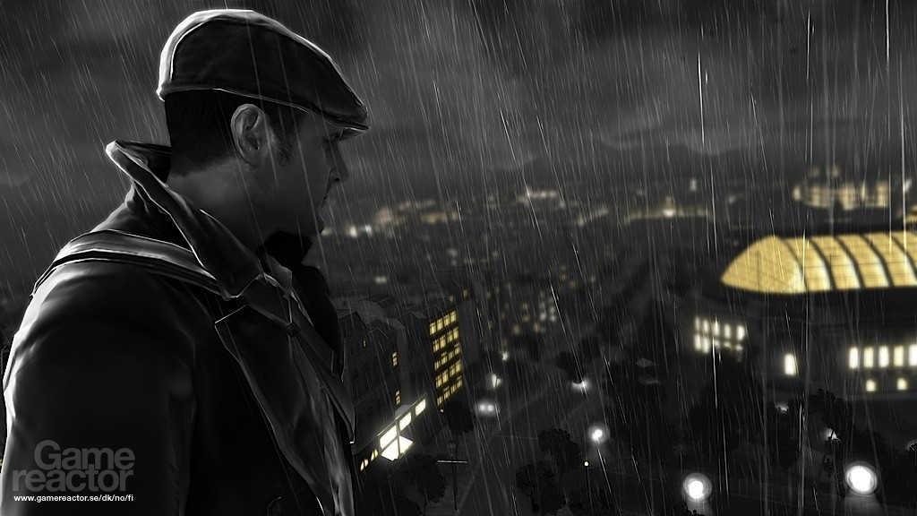
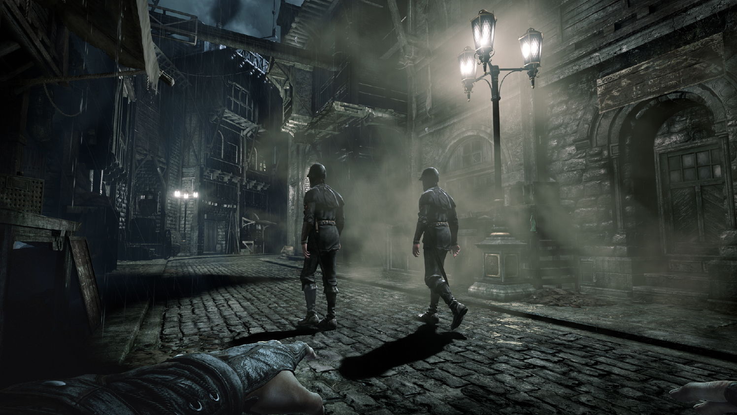
Dark / Gloomy

The Order 1886

Inside

Bloodborne
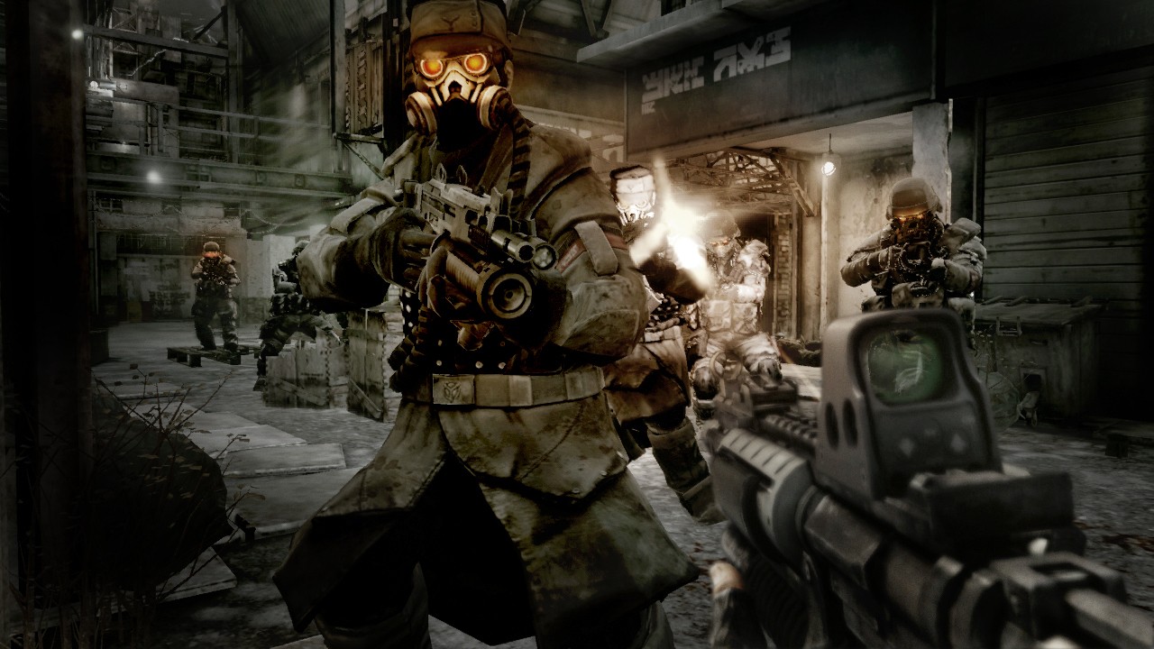
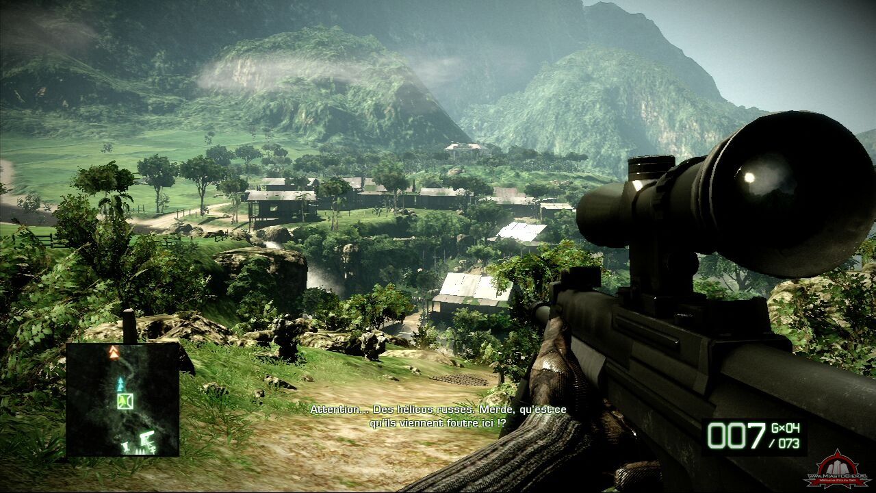
Killzone 2
VS.
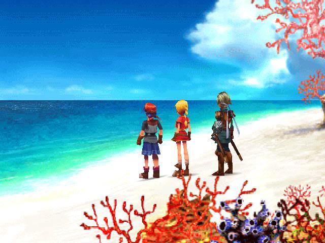
Bright / Colourful
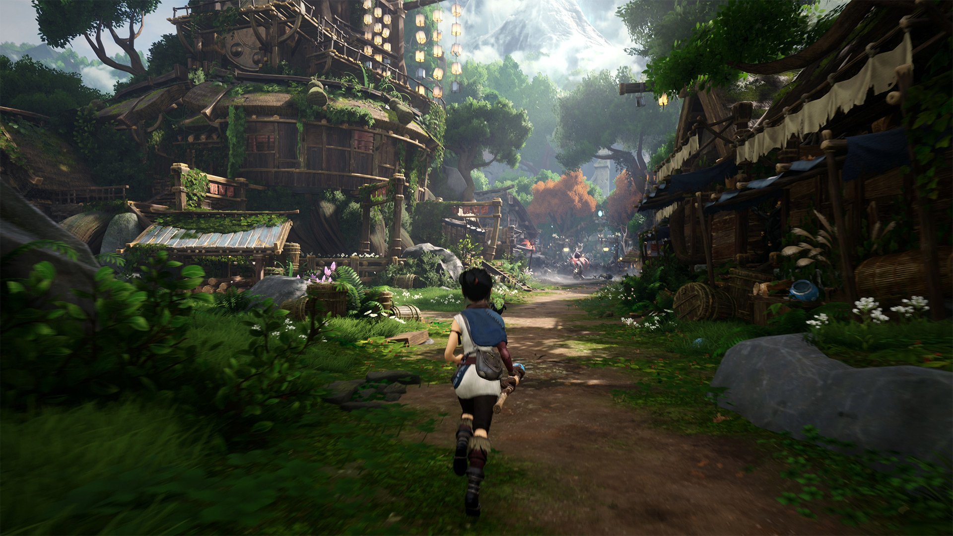
Kena
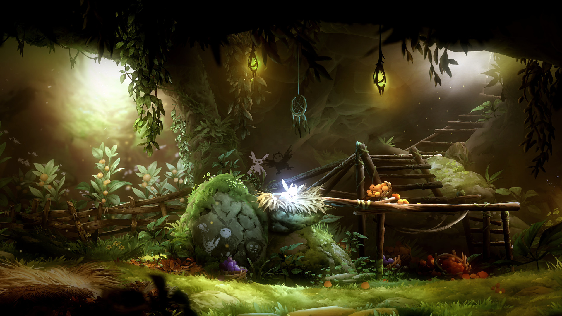
Ori and The Will of the Wisps
Mirror's Edge Catalyst
Red Dead Redemption 2
I personally have a particular liking for dark atmospheric games
Having said that, I do enjoy colourful visuals with the right art direction (e.g. Mirror's edge, RDR2, Horizon)
but if I were to pick only one, I would definitely choose dark and gloomy
BUT
what would you prefer if there were a choice and a degree of wiggle room for the art direction of a game that can benefit equally from either style?
The Order 1886
Inside
Bloodborne
Killzone 2
VS.
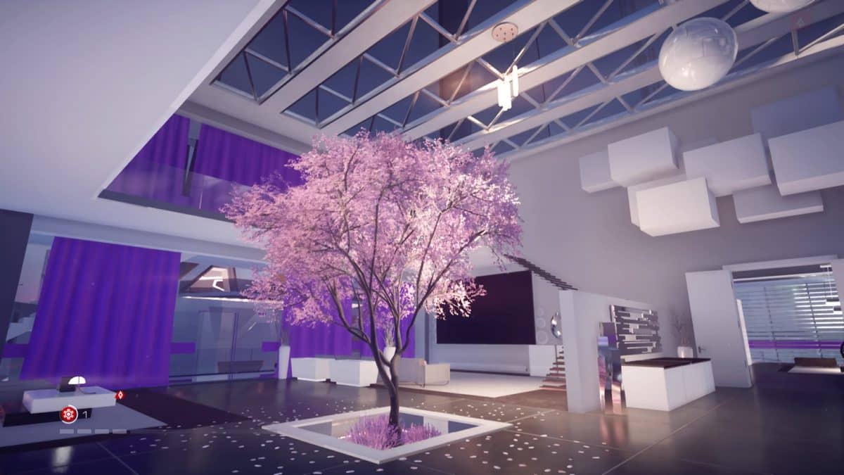
Bright / Colourful
Kena
Ori and The Will of the Wisps
Mirror's Edge Catalyst
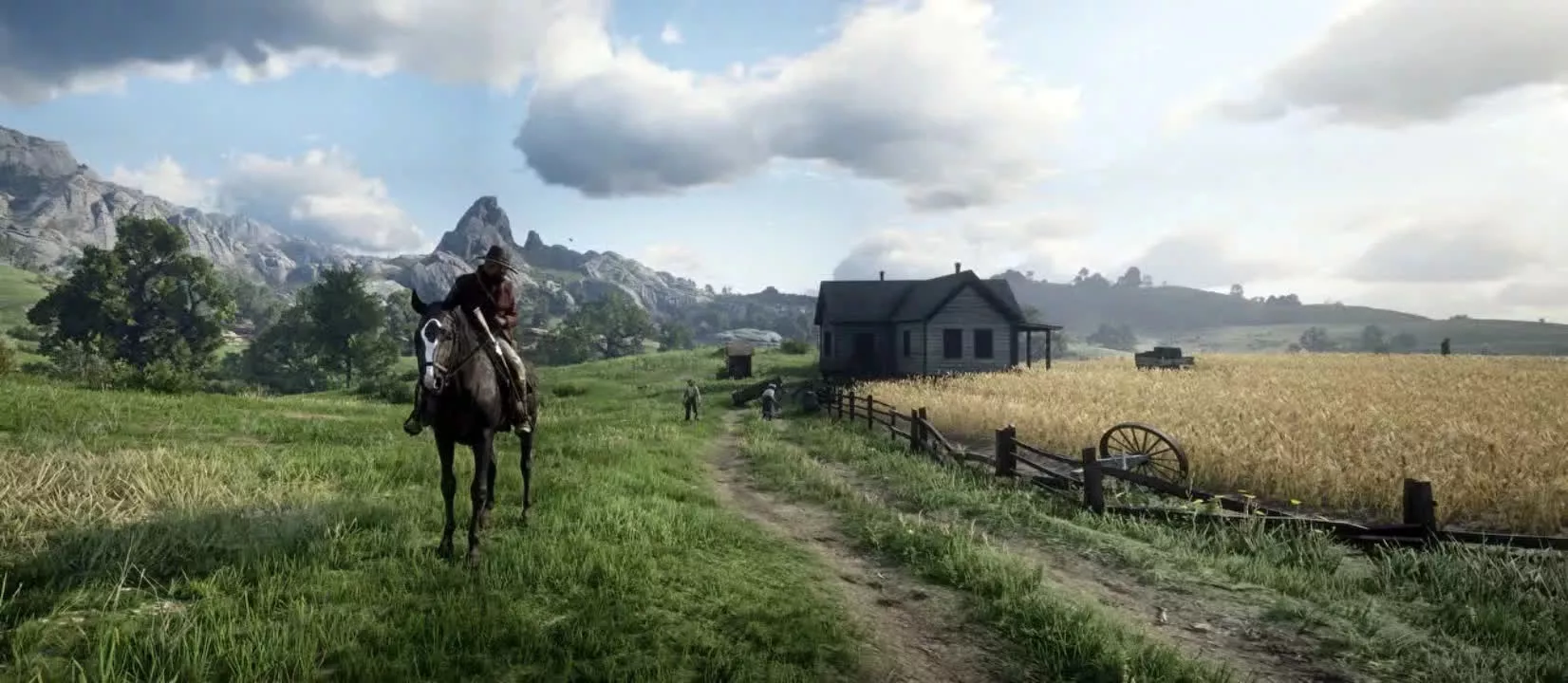
Red Dead Redemption 2
I personally have a particular liking for dark atmospheric games
Having said that, I do enjoy colourful visuals with the right art direction (e.g. Mirror's edge, RDR2, Horizon)
but if I were to pick only one, I would definitely choose dark and gloomy
BUT
what would you prefer if there were a choice and a degree of wiggle room for the art direction of a game that can benefit equally from either style?
Last edited: