-
Hey, guest user. Hope you're enjoying NeoGAF! Have you considered registering for an account? Come join us and add your take to the daily discourse.
You are using an out of date browser. It may not display this or other websites correctly.
You should upgrade or use an alternative browser.
You should upgrade or use an alternative browser.
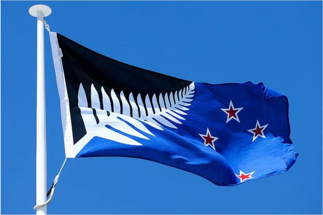
New Zealand's new flag might be Silver Fern (Red, White, and Blue)
- Thread starter lastplayed
- Start date
- Status
- Not open for further replies.
lastplayed
Member
I think Savitar was talking about the one that actually won. It is, indeed, an ugly ass flag. New Zealand fucked up.
It's not over yet. Next year the winner goes against the current flag.
neogaffer1
Banned
that is the best one in the bunch, love the color scheme.
the Red Peak one looks like a hardware store logo
that's not a very good flag.
the red peak one is more stylish than that. in fact most of them are more stylish than that. the silver fern is just not great design.
D
Deleted member 231381
Unconfirmed Member
lol you literally picked the worst option from the short-list
you blew it, NZ
you blew it, NZ

Butts-a-plenty
Banned
lol you literally picked the worst option from the short-list
you blew it, NZ
They still have to vote against he current flag.
Hmm, still looks better than having a bloody union jack...That was my least favourite one of the lot. It doesn't look good. I'll vote to keep the current flag when the time comes and I really hope we don't settle for that shit as a representation of our nation.

Sir_Crocodile
Member
I don't think New Zealand want to pay Buena Vista every time they use their flag
SuperBanana
Banned
Way better flag, the old one was shit. Now for Australia to get rid of the union jack too.
Dynamite Shikoku
Congratulations, you really deserve it!
Looks like utter shit
Art Teitlebaum
Member
Not a NZer, but this was my favourite as well.
That ugly RedPeak really looks like a corporate logo.
That ugly RedPeak really looks like a corporate logo.
eot
Banned
I didn't think any of them were fantastic, but I would've gone with this one:

You blew it NZ. RIP Red Peak
This would have been good too. It's not every day a country can pick it5s own flag.
I didn't think any of them were fantastic, but I would've gone with this one:
This would have been good too. It's not every day a country can pick it5s own flag.
I didn't think any of them were fantastic, but I would've gone with this one:
It's like a logo for some weird Coca Cola/Pepsi crossover drink.
Ganzlinger
Member
the older flag with the Union Jack is better.
that is the best one in the bunch, love the color scheme.
the Red Peak one looks like a hardware store logo
Thats a brilliant flag. Much better than the union jack flag.
D
Deleted member 231381
Unconfirmed Member
Red Peak was literally the only good potential national flag on the shortlist. The others looked like sports logos or pirate flags.
LiquidSolid
Member
Oh, please. I did point out that yes, the silver fern has a lot of cultural meaning. I was referring specifically to the style of white fern on a solid black background being strongly tied to the all blacks to me personally as a reason why I find it not a particularly appealing look for a flag.
Your language of "to me and most NZers" reeks of argumentum ad populum. Speak for yourself, don't claim to speak for your country. Also, calling someone ignorant for their personal opinion on the desirability of a flag design is completely irrelevant to the argument at hand.
I must've missed this back when you posted it but seeing as the white fern and black background are a fundamental part of the symbol, both before and after the All Blacks adopted it, I'm sticking with the ignorance call out. And in case you don't know, opinions can be ignorant.
As for the argumentum ad populum accusation, really? In a thread about a national referendum?
I think Savitar was talking about the one that actually won. It is, indeed, an ugly ass flag. New Zealand fucked up.
The only people who fucked up are the government, the selection process in particular was a joke, resulting in a choice between five awful flags, and they've completely failed to get the country interested in it. They're hoping that people will suddenly come around to it, now that we've got the potential new flag decided, but that's not going to happen.
Stumpokapow
listen to the mad man
I think changing your flag is a great way to have a conversation about identity and about what the country means. I think it's inevitable relatively few people got interested because a lot of people aren't interested in thinking about identity and meaning beyond "Me Me Me Where's The Next Marvel Movie???? Damn What Did Bieber Do Now???". If you have no sense of collective investment or belonging then it's going to be hard to feel engaged with this kind of process. Still, 50% is not a bad turnout.
I agree that the designs -- particularly having 3 of the 4 original designs include the fern -- probably weren't representative of the breadth of stuff available. And that the change seems to be largely being imposed top-down.
I agree that the designs -- particularly having 3 of the 4 original designs include the fern -- probably weren't representative of the breadth of stuff available. And that the change seems to be largely being imposed top-down.
That flag is what happens when you try and please everyone.
Yeah. I was talking to my brother about it and he called it a flag designed by committee which pretty much sums it up for me.
On top of that the execution isn't even good. It looks like something designed by a year 11 design student.
I agree that the designs -- particularly having 3 of the 4 original designs include the fern -- probably weren't representative of the breadth of stuff available. And that the change seems to be largely being imposed top-down.
Yeah, this is John Key's pet project and he's trying really hard to push his favourite design onto us.
Hmm, still looks better than having a bloody union jack...
We can always try to change the flag again in 10 years time, this time around by contracting actual designers. If we change the flag now we'll be stuck with that shit for a long time in all likelihood.
Ampersands
Member
I don't really get the hate for the flag. I think it looks nice and it's definitely much better than the atrocity New Zealand had before.
Freestyler
Member
The winner is beautiful. It was my #2 choice on my voting paper, so I'm not too upset that Red Peak didn't win. I was very surprised with how much of a thumping Red Peak took though, I thought it'd be a close race.
I'm glad that the Blue, White & Red fern didn't win, it was far too USA for my tastes.
Also, to those saying "we'll end up sticking with the current flag anyway", I'm not sure if the referendum in March is binding. Do you not remember the "Sale of State Owned Enterprises" vote, in which 67% of voters said no, yet the government still went ahead with the sale?
I am 90% confident that by March 2016 we will have a gorgeous new flag. Goodbye horrid Union Flag/Jack!!
yanipheonu
Member
I like it. Coming off of my own Canadian flag, I like the idea of incorporating local fauna into the flag. Seems as good as any symbol to use to represent a land,
gutter_trash
Banned
Red Peak looks too much like an industrial park corporate logo
titiklabingapat
Member
You had one chance NZ and you blew it.
The new one looks like it was designed by committe and compromises and it looks it. It won't age well. It's too busy and seems like it doesn't know where it wants to go so it tries to do everything, which is the worse thing you can do in a flag. A national flag should have no more than three colors, should be simple and a five year old should be able to draw it.
Most great world flags are simple tri-bars or less for a reason, or only has one element like the iconic Japanese or Canadian flags.
Mr. Pointy
Member
The problem with that silver fern flag is the red southern cross. If you change that to white or remove it entirely, might look ok.
Freestyler
Member
You had one chance NZ and you blew it.
The new one looks like it was designed by committe and compromises and it looks it. It won't age well. It's too busy and seems like it doesn't know where it wants to go so it tries to do everything, which is the worse thing you can do in a flag. A national flag should have no more than three colors, should be simple and a five year old should be able to draw it.
Most great world flags are simple tri-bars or less for a reason, or only has one element like the iconic Japanese or Canadian flags.
Lol "should have no more than three colours". Is there some kind of international rule about flag colours?
I couldn't care less if a child can draw the flag. I'd like to see them draw a perfect maple leaf for a Canadian flag or a perfect Union Jack.
I really like it. Completely unique, there's no 2 flags in the world like it. It just screams New Zealand to me.
As a New Zealander, I find the winning option better than the current flag, but only marginally.
The process of arriving at and developing the options has been terrible. No chance for iteration on interesting or popular concepts or designs at all. Unsurprising given a lack of designers involved, and a committee who just assumed if you had enough first pass options then surely the "best" flag would emerge.
Personally, I think the winning option could have been better, ditching the blue for black, being just black, white, and red for example. Even then it falls short of ideal.
Such a missed opportunity.
What I really don't like about the winning flag is that they basically just looked at the current flag, went "yeah the right half looks pretty cool, let's keep that" and then added a fern on the side and painted the top left corner black to go with it.
They should have just let go of the old design entirely and come up with some truly novel ideas. Canada didn't just stick a maple leaf on the corner of their flag and called it a day. And now they've got what is probably one of the best flag designs in the world.
They should have just let go of the old design entirely and come up with some truly novel ideas. Canada didn't just stick a maple leaf on the corner of their flag and called it a day. And now they've got what is probably one of the best flag designs in the world.
What I really don't like about the winning flag is that they basically just looked at the current flag, went "yeah the right half looks pretty cool, let's keep that" and then added a fern on the side and painted the top left corner black to go with it.
They should have just let go of the old design entirely and come up with some truly novel ideas.
Yeah. It screams "compromise".
lastplayed
Member
The problem with that silver fern flag is the red southern cross. If you change that to white or remove it entirely, might look ok.
Yeah you're right. The civil and naval flags got this right.


titiklabingapat
Member
Lol "should have no more than three colours". Is there some kind of international rule about flag colours?
I couldn't care less if a child can draw the flag. I'd like to see them draw a perfect maple leaf for a Canadian flag or a perfect Union Jack.
Not an international rule but they do have people studying this stuff, kinda like with graphic design.
https://en.wikipedia.org/wiki/Vexillology
https://www.ted.com/talks/roman_mar...signed_thing_you_ve_never_noticed?language=en
A place's flag, and whether or not people like it or associate it with pride makes a big impact on how people perceive their country, state/province or city.
- Status
- Not open for further replies.