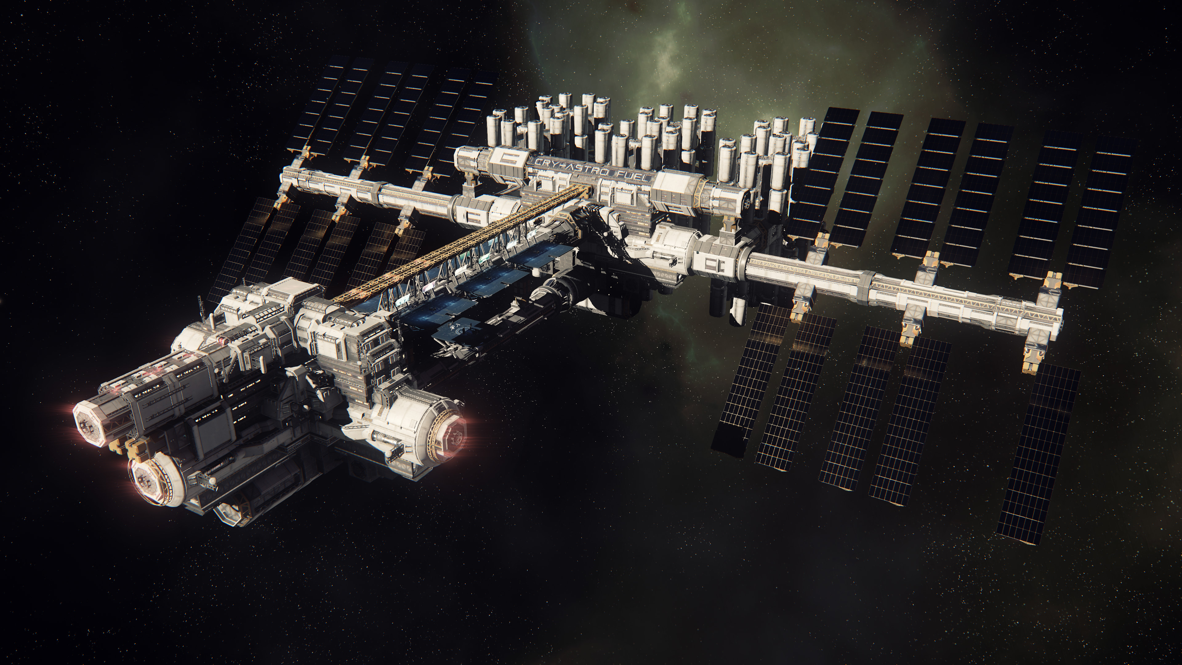
Thanks.The latest Around the Verse. Here's a video with just the constellation clips:
https://youtu.be/SY2ATSVUvxA
-
Hey, guest user. Hope you're enjoying NeoGAF! Have you considered registering for an account? Come join us and add your take to the daily discourse.
You are using an out of date browser. It may not display this or other websites correctly.
You should upgrade or use an alternative browser.
You should upgrade or use an alternative browser.
Star Citizen Pre-Alpha: 'Arena Commander' Dogfighting
- Thread starter MrBig
- Start date
- Status
- Not open for further replies.
Zalusithix
Member
Here's some quick texture variations for the black part along with some general changes to the surface's smoothness and reflectivity where needed.
Brushed Metal:

Granite:

Carbon Fiber

Brushed Metal:
Granite:
Carbon Fiber
Rephin
Member
Here's some quick texture variations for the black part along with some general changes to the surface's smoothness and reflectivity where needed.
I'm kinda partial to that granite one. The blackness looks like it's speckled with stars, it's kind of cool.
That's exactly what I thought too. Granite / stars would be sweet.I'm kinda partial to that granite one. The blackness looks like it's speckled with stars, it's kind of cool.
I like the granite one, but i think it would look better if it had a polished look to it.Here's some quick texture variations for the black part along with some general changes to the surface's smoothness and reflectivity where needed.
Dictator93
Member
Zalusithix
Member
I'll do a veined marble to contrast with the speckled granite tonight. As far as environment maps and lighting goes, right now everything is lit with a very basic 3 light setup with no environment/world map being reflected. The "lights" (really emmisive planes) aren't set to be particularly bright and are arranged to avoid glare spots. The one exception to that is the main light at the lower right. With a highly reflective surface for the black part it'll have a solid white tilted rectangle in the corner.Edit initially said marbled black granite, but it's actually just black marble for the look I was thinking of.
Maybe use a sparse star field as an environment map (or just a few distant point light sources I guess)? Wouldn't want this huge flash reflection of course.
Also, getting the feel of being lit by star light to some extent was one of the original end goals, but whether I'll be able to do that with my lack of skills remains to be seen lol.
I like the granite one, but i think it would look better if it had a polished look to it.
It is glossy, but not a mirror level polish. A highly reflective surface would actually look worse with the lighting setup as it'd create a glare spot as mentioned above. I don't want to move lights and change brightness levels between samples to keep the comparisons fair.
That said, a super reflective surface wouldn't be the best anyhow. The gold is already quite mirrored and care has been taken with the lighting to not get glare spots. Making the whole thing into a polished surfaces would make lighting that much more finicky. Plus having contrast between the top and bottom's reflectivity is more visually interesting than having the whole thing be equally shiny IMO.
I'll do a veined marble to contrast with the speckled granite tonight. As far as environment maps and lighting goes, right now everything is lit with a very basic 3 light setup with no environment/world map being reflected. The "lights" (really emmisive planes) aren't set to be particularly bright and are arranged to avoid glare spots. The one exception to that is the main light at the lower right. With a highly reflective surface for the black part it'll have a solid white tilted rectangle in the corner.
Also, getting the feel of being lit by star light to some extent was one of the original end goals, but whether I'll be able to do that with my lack of skills remains to be seen lol.
Looking at them now, the speckled granite will probably work out better I think - the veins would wind up creating funny-looking lines on the icon when it was shrunk down for list views. No harm in trying it out though.
Regarding the "lit by stars" feel, I'd say try making the background pure black and then put a bunch of intense point light sources far behind the viewer, toward the bottom so they're actually reflected in the granite (but not the gold), then maybe tweak the surface properties to see if you prefer more mirror-like reflections or a bit more diffusion.
Sleepy Buddha
Member
That looks so amazing, so much detail, can't wait to see mine at 2 to 5 fps in my hangar!
Makes me even more pumped for my other ships!
Zalusithix
Member
Looking at them now, the speckled granite will probably work out better I think - the veins would wind up creating funny-looking lines on the icon when it was shrunk down for list views. No harm in trying it out though.
Regarding the "lit by stars" feel, I'd say try making the background pure black and then put a bunch of intense point light sources far behind the viewer, toward the bottom so they're actually reflected in the granite (but not the gold), then maybe tweak the surface properties to see if you prefer more mirror-like reflections or a bit more diffusion.
Well this is a 3D model and will never be ideal when shrunk down to icon level sizes. It'll work fine as something integrated into the banner section of the org page, but using it for the emblem/icon part is iffy. It renders with transparency (the background was added in Photoshop), so that's not a problem, but it's not great as a simple graphic. It was made to be a physical representation of the logo. Hence my interest in exploring the halo/horizon zig zag idea for the actual icon. It's extremely visible on dark backgrounds like RSI's site and can be easily distilled to the core elements for a 2D vector image rather than a render.
As for lights in the granite and not gold... that'd require interesting lighting. Given these are renders which raytrace the light sources, any light source will cast to all surfaces and bounce around between them. Would have to use highly directional lights at the right angles to sell that effect. Might be better to just emphasize the "star" aspect of the granite itself. Have the white specs have a different reflectivity/refraction from the rest of the rock so they catch the light and sparkle a bit. I'll have to play with that and see if I can get it to work. (Step one is concept. Step two is seeing if I can actually do something in Blender with my limited knowledge lol.)
Rephin
Member
That looks so amazing, so much detail, can't wait to see mine at 2 to 5 fps in my hangar!
Makes me even more pumped for my other ships!
I'm surprised they managed to make the Connie look better with half a million polys less than the original. Amazing. I kind of want one now (but I know I don't need one... but I WANT one!).
Thanks.
I was going to suggest that, but then i edited my post last night. Looking forward to seeing it.I'll do a veined marble to contrast with the speckled granite tonight.
Ahhh. Sorry.It is glossy, but not a mirror level polish. A highly reflective surface would actually look worse with the lighting setup as it'd create a glare spot as mentioned above. I don't want to move lights and change brightness levels between samples to keep the comparisons fair.
That said, a super reflective surface wouldn't be the best anyhow. The gold is already quite mirrored and care has been taken with the lighting to not get glare spots. Making the whole thing into a polished surfaces would make lighting that much more finicky. Plus having contrast between the top and bottom's reflectivity is more visually interesting than having the whole thing be equally shiny IMO.
Dictator93
Member
Posting to take a breath from the Paris awfulness. RIP
Yeah, just found out as I was in a game for 2 hours and I am just appalled :/
I hope it ends as soon as possible.
MasterOfPastures
Banned
Dictator93
Member
The resolution and distance which those shadow maps are rendering is quite unreal. I wonder how they are doing it...
MasterOfPastures
Banned
The resolution and distance which those shadow maps are rendering is quite unreal. I wonder how they are doing it...
Not to be a downer, but those are probably done in the "Community pictures" mode that crawls at 4 fps.
Zalusithix
Member
After testing a number of textures that were less than flattering, I managed to get this version which has the veins, but isn't overly busy and has a nice solid blackness outside of the veins.I was going to suggest that, but then i edited my post last night. Looking forward to seeing it.

I'm not sure how I feel about it. The white veins are striking, but because of that they compete with the zig zag for the eye's attention and reduce the "pop" of it.
Here's another take on the granite with an improved texture:

Another aspect of the granite is that by scaling the texture, you can kind of change the scope of the star field illusion. Scaling the texture down results in more numerous, but smaller flecks. (Which I prefer in this case.)

This will likely be my last bit of work on it for the weekend, as I'll be spending most of my free time taking advantage of the Blade and Soul CBT period.
Edit: Quick last addition. In the above renders, I converted the granite texture to B&W to closer emulate the previous granite texture, but I figure I should show what it looks like with the original colors.

^ Oh, nice, that's a much better marble texture than the ones I was able to find. A bit like an impressionist version of the Hubble Deep Field images.

The new fourth one looks a bit like that too, actually. Think I like that version the best.
---
I got my replacement Steam controller and I got a chance to try out the grip trigger = roll idea. It works, but it takes a hell of a lot of coordination, lol. I'm glad I'll have those pedals later to free up those channels.
With this setup, the analog triggers are taking the place of the pedals.
Biggest challenge at the moment is I wind up accidentally boosting by pressing the trigger down all the way if I'm also trying to shoot (right bumper) or roll right (right grip). It's fun tackling the novelty of it until they get the controller+pedal combo to work.
For people just using the controller, it's probably better to use throttle up/down controls to avoid having to hold the right trigger down most of the time as your forward thrust. One less thing to have to coordinate. I just liked having the direct control of it.
The new fourth one looks a bit like that too, actually. Think I like that version the best.
---
I got my replacement Steam controller and I got a chance to try out the grip trigger = roll idea. It works, but it takes a hell of a lot of coordination, lol. I'm glad I'll have those pedals later to free up those channels.
With this setup, the analog triggers are taking the place of the pedals.
Code:
Right trigger: forward strafe (analog)
- second stage click: Boost

Left trigger: backward strafe (analog)
- second stage click: nothing yet

Right bumper: primary fire
Left bumper: secondary fire

Grip triggers: roll (digital)

Left touchpad: d-pad (target selection, etc)

Left stick: horizontal+vertical strafe (analog)

Right touchpad: mouse (trackball mode) for pitch+yaw
Gyro: fine mouse control while right pad is touched
Biggest challenge at the moment is I wind up accidentally boosting by pressing the trigger down all the way if I'm also trying to shoot (right bumper) or roll right (right grip). It's fun tackling the novelty of it until they get the controller+pedal combo to work.
For people just using the controller, it's probably better to use throttle up/down controls to avoid having to hold the right trigger down most of the time as your forward thrust. One less thing to have to coordinate. I just liked having the direct control of it.
I want to make love to this one
Irobot82
Member
After testing a number of textures that were less than flattering, I managed to get this version which has the veins, but isn't overly busy and has a nice solid blackness outside of the veins.
]
Is there a way to maybe give the gold some impoerfection, like a slight brushed metalic look?
The resolution and distance which those shadow maps are rendering is quite unreal. I wonder how they are doing it...
I saw a developer mention exactly this on the front page:
https://forums.robertsspaceindustries.com/discussion/comment/5905505/#Comment_5905505
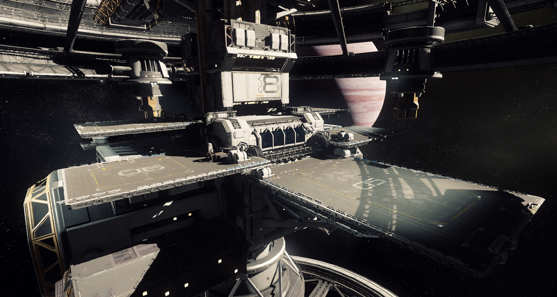
As it happens, this is a longstanding CryEngine feature we've re-activated and have some plans for. It's basically a 4k shadow map that's rendered once and kept around for as long as necessary. Downside: Nothing can move in it (at least for now). Upside: You only draw it once.
At the moment there can only be one alive at a time, but it boxes around the feature in question (in this case the space station) rather than around the player so you get decent stable shadows there. When you get closer the standard shadow cascades kick in to give you up-close detail.
This is my favorite of the bunch.
Yeah, that's a shame.After testing a number of textures that were less than flattering, I managed to get this version which has the veins, but isn't overly busy and has a nice solid blackness outside of the veins.
I'm not sure how I feel about it. The white veins are striking, but because of that they compete with the zig zag for the eye's attention and reduce the "pop" of it.
This my favourite one.Another aspect of the granite is that by scaling the texture, you can kind of change the scope of the star field illusion. Scaling the texture down results in more numerous, but smaller flecks. (Which I prefer in this case.)
Really looking forward to The Next Great
Space Marine.
From RtV:
- the prerequisite will be designing your own helmet
- the actual competition will be designing a class 9 titan suit
- confirmed judges are CR, Omar, Forrest, Skelton, Sean Tracy + guest judge
- submissions due end of January
- will run for ~ 3 months
- sponsors and prizes tba
Bald
From RtV:
- the prerequisite will be designing your own helmet
- the actual competition will be designing a class 9 titan suit
- confirmed judges are CR, Omar, Forrest, Skelton, Sean Tracy + guest judge
- submissions due end of January
- will run for ~ 3 months
- sponsors and prizes tba
Dictator93
Member
I saw a developer mention exactly this on the front page:
https://forums.robertsspaceindustries.com/discussion/comment/5905505/#Comment_5905505
0o0!
Take a look who asked the question btw

Zalusithix
Member
Is there a way to maybe give the gold some impoerfection, like a slight brushed metalic look?
An intentional macro level imperfection like a brushed metal effect would look odd as we're dealing with a polished metal as the target. That said, it is possible to give the surface imperfections in other ways that retain a polished look. One would be to keep the surface itself polished, but make the surface as a whole appear less than flat as if there were casting imperfections.

Another would be to keep the surface perfectly flat, but apply damage like hairline scratches to it (soft metals scratch easily).

Finally, you can combine these approaches and have a slightly deformed surface that also has micro level imperfections.
Edit: The flat spot on the left side finally bugged me enough to fix it, so this is the first render to not have it.

These are rendered with the granite version that most people liked, but with the color restored instead of being B&W. Also, the effects in the gold are quick and dirty with strength higher than would be ideal to exaggerate the end result. This is less a material choice though, and more of a final touches sort of thing and I'm not going to spend a lot of time on minor things like that right now.
Zalusithix
Member
Maybe I'm weird, but I think I still like the gold with no effects, and the black-and-white granite, better than any of those.
Eh, just a matter if you want a weathered look or not. The end version will likely have some level of imperfection, but I doubt it'll be to the level you see in those. As for the granite color, there hasn't been much direct comparisons between them, as most of the discussion has been on what material to use in general. If we assume that granite style is the direction taken, multiple color profiles are possible.
Here's a blue spec version: (Featuring the worn top, sorry.
)
And here's a version that mixes the red, blue, and monochrome versions: (Inspired by Raticus's posted deep field image.)

Starbuck2907
Member
Brushed metal is my fav.
Granite makes me feel like I'm looking at a kitchen counter or bathroom countertop. Maybe even walking into a high end bank or hotel.
Metal seems more "space sim" and sleek to me.
Just my 2 cents.
Granite makes me feel like I'm looking at a kitchen counter or bathroom countertop. Maybe even walking into a high end bank or hotel.
Metal seems more "space sim" and sleek to me.
Just my 2 cents.
Dictator93
Member
TBH, they all look so fucking cool. Really hard to say which one I like the most!
Irobot82
Member
An intentional macro level imperfection like a brushed metal effect would look odd as we're dealing with a polished metal as the target. That said, it is possible to give the surface imperfections in other ways that retain a polished look. One would be to keep the surface itself polished, but make the surface as a whole appear less than flat as if there were casting imperfections.
Another would be to keep the surface perfectly flat, but apply damage like hairline scratches to it (soft metals scratch easily).
Finally, you can combine these approaches and have a slightly deformed surface that also has micro level imperfections.
Edit: The flat spot on the left side finally bugged me enough to fix it, so this is the first render to not have it.
These are rendered with the granite version that most people liked, but with the color restored instead of being B&W. Also, the effects in the gold are quick and dirty with strength higher than would be ideal to exaggerate the end result. This is less a material choice though, and more of a final touches sort of thing and I'm not going to spend a lot of time on minor things like that right now.
I guess I didn't describe it well but option 2 looks perfect!!!!!
Zalusithix
Member
Brushed metal is my fav.
Granite makes me feel like I'm looking at a kitchen counter or bathroom countertop. Maybe even walking into a high end bank or hotel.
Metal seems more "space sim" and sleek to me.
Just my 2 cents.
Kind of funny you mention that, because the "high end bank or hotel" isn't too far off from the location it'll be sitting at. Given the "Foundation" aspect of the backronym "Galactic Advancement Foundation", I imagine this as being something that you'd see at the HQ. Rocks like marble and granite are used quite often in sculpture work, so it seems at home there as much as any other material.
I do like the brushed metal look myself, though it's probably because most of my electronics are housed in anodized brushed aluminum. It'd certainly make more sense than granite for something that you'd carry around. Perhaps a token to prove membership in the foundation?
Re-render of the brushed metal version with slightly worn gold top.

The kind of fun part about this is you could technically make one of these in real life. Even the emissive nature of the center. Get a cloudy glass disc, insert it between the two hollow halves that have LEDs embedded in them. The LED's light will scatter through the glass and emit from the visible part of the zig zag.
The kind of fun part about this is you could technically make one of these in real life. Even the emissive nature of the center. Get a cloudy glass disc, insert it between the two hollow halves that have LEDs embedded in them. The LED's light will scatter through the glass and emit from the visible part of the zig zag.
Now I kinda want to make one. To the laser cutter!
And here's a version that mixes the red, blue, and monochrome versions: (Inspired by Raticus's posted deep field image.)
I think you should take the granite from the first pic, and the gold from the second pic and then combine them, and that would be perfect.Re-render of the brushed metal version with slightly worn gold top.
I guess the biggest problem with the brushed metal thing (aside from no cool stars) is that the metal gives the effect of unintentional color banding, which can be an annoying thing in games. Just mental association for me.Kind of funny you mention that, because the "high end bank or hotel" isn't too far off from the location it'll be sitting at. Given the "Foundation" aspect of the backronym "Galactic Advancement Foundation", I imagine this as being something that you'd see at the HQ. Rocks like marble and granite are used quite often in sculpture work, so it seems at home there as much as any other material.
I do like the brushed metal look myself, though it's probably because most of my electronics are housed in anodized brushed aluminum. It'd certainly make more sense than granite for something that you'd carry around. Perhaps a token to prove membership in the foundation?
Re-render of the brushed metal version with slightly worn gold top.
The kind of fun part about this is you could technically make one of these in real life. Even the emissive nature of the center. Get a cloudy glass disc, insert it between the two hollow halves that have LEDs embedded in them. The LED's light will scatter through the glass and emit from the visible part of the zig zag.
Zalusithix
Member
I guess the biggest problem with the brushed metal thing (aside from no cool stars) is that the metal gives the effect of unintentional color banding, which can be an annoying thing in games. Just mental association for me.
One benefit of metal is it's easy to add text that looks like it belongs. Like in the mock up below, it can be mentally taken as embossed text from the original milling/casting that got polished after everything else was brushed and black anodized. It also kind of balances out the comparatively featureless face that the brushed metal presents. Slap the same thing on the granite and it just looks off/cheap. Like some adhesive backed letters stuck on the surface. Any potential text rendering on the granite surface is going to have to be engraved into the surface first and then refilled (partially or otherwise) with another material to look decent I think.
Metal text on metal:

Metal text on granite:

Font selection, size, spacing, placement, and the text itself are all for demonstration purposes. Settings were changed between the two renders, but they're close enough to demonstrate how the granite is lacking under similar settings.
Edit:
Well, I found an error in the way the textures/normals were being mapped. This can be seen in the renders where the gold is using a normal map to appear imperfect. If you look closely, you can barely see a darker line going horizontally through the surface where the peak is. It becomes much worse with any direct lighting, and prompted me to figure out what was causing it. That's fixed, but in doing so, everything renders a bit differently now. This is especially true for highly reflective surfaces like the gold part.
The render below is using the same settings as used above, but with the fix applied. Basically the gold became more reflective, but because there's no direct lighting, it became darker and any minor detail is invisible.

When you subject it to direct lighting though, it's actually fairly diffuse and looks more like unpolished gold.

Thus I started to manipulate the shader nodes to get a polished gold when exposed to light. This in turn makes it even darker still when using the existing lighting, but is really rather accurate. There's only one light aimed at the face in all the renders so far, and it's a directional area light aimed towards the bottom of it. The only light aimed at the top gold part comes from the top sides at relatively extreme angles, and provides the halo effect on the edge.

Subject it to direct lighting, however, and you can see the metal behave like a polished surface would.

So the question now I guess becomes whether we want the more diffuse gold, or the more polished gold.
Edit 2: Figured out more or less how to make text look right for the granite. No bevel, set at surface level, and change material to gold. (Cheating a bit here using the diffuse gold on the lettering so it stays more visible in low light on the left.) Also flipped to a modified blue granite with lower noise density so as to not grab the eye so much.

Dictator93
Member
Monday, November 16th
- [1500 PST / 2300 UTC] 10 for the Chairman: Episode 70
Tuesday, November 17th
- Jump Point Rerun
Wednesday, November 18th
- Vault Update
- [1500 PST / 2300 UTC] Bugsmashers: Episode 15
Thursday, November 19th
- [1100 PST / 1900 UTC] Star Citizen Anniversary Livestream - http://www.twitch.tv/starcitizen
- Design Post: Repair Systems
Friday, November 20th
- [1100 PST / 1900 UTC] Reverse the Verse: The Community Team's Weekly Livestream - http://www.twitch.tv/cigcommunity
- Weekly Development Update: Week of November 20th
- Jump Point: Issue 3-11
So what do you guys think they will show off during the live stream? Procedural gen? Voxel asteroids? Multi-crew damage? FPS?
CR's Corvette collection?
Sax Russel
Banned
So what do you guys think they will show off during the live stream? Procedural gen? Voxel asteroids? Multi-crew damage? FPS?
CR's Corvette collection?
A build of 2.0 that's barely hanging together ;D, out soon, really!
I kid I kid.
The Corvette collection obviously. Maybe someone will have a new haircut.
Warning facebook link.
Zero-G animation driven ragdoll physics in eva mode.
https://www.facebook.com/215475438505750/videos/943769532343000/
Zero-G animation driven ragdoll physics in eva mode.
https://www.facebook.com/215475438505750/videos/943769532343000/
kutthoat5150
Member
Warning facebook link.
Zero-G animation driven ragdoll physics in eva mode.
https://www.facebook.com/215475438505750/videos/943769532343000/
those weapon swap animations look very smooth, hope to see more zero G during the stream
Dictator93
Member
Warning facebook link.
Zero-G animation driven ragdoll physics in eva mode.
https://www.facebook.com/215475438505750/videos/943769532343000/
those weapon swap animations look very smooth, hope to see more zero G during the stream
So fucking cool. Animations mixing with physics and ragdoll are so awesome. Euophoria like here.
You can see how his legs and body parts have inertia when he changes vector and they drag: even without colliding. So awesome.
So what do you guys think they will show off during the live stream? Procedural gen? Voxel asteroids? Multi-crew damage? FPS?
CR's Corvette collection?
Hopefully the improved Morrow tour video.
So what do you guys think they will show off during the live stream? Procedural gen? Voxel asteroids? Multi-crew damage? FPS?
CR's Corvette collection?
Thursday fuck! Why is it always a day when i'm not home?
Ps. I'm personally counting on the second cutscene with Bishop.
Nah, I don't think so. Unless they mentioned it somewhere? I think the Frankfurt guys are very much in the middle of everything right now, we'll probably see more of Bishop and the other characters when the tech is further along and the improvement is noticable.
Hopefully the improved Morrow tour video.
That's my guess as well. Maybe a WIP version of the planetary entry / landing sequence? They are both things they've already shown in one form or another, so an update seems well within expectations.
Zalusithix
Member
That's my guess as well. Maybe a WIP version of the planetary entry / landing sequence? They are both things they've already shown in one form or another, so an update seems well within expectations.
The desire to walk around the Idris is already bad enough. I don't need another reminder that the ship is pretty much done, but not hanger ready. =P As for the planetary landings... how about the reverse? We've seen a couple landing sequences now, but to my recollection we haven't seen a planet to space launch transition yet.
And skipping gears back to the render, I've decided to go in two directions at once for refinement. One will be the granite version that you'd see in something like a HQ. Polished gold, elegant feeling, meant to be relatively large (clock sized at the least). The other will be a smaller member token using aluminum and the rougher gold. First steps towards the tokenized version below.

Using my nick for testing, because why not?
Edit: Wish it would at least collapse the images in spoiler tags... Tired of sucking up vertical space.https://youtu.be/ezrghcBRcSk?t=842
Chris basically confirmed that they have almost working seemless procedural planetary landing :O
Chris basically confirmed that they have almost working seemless procedural planetary landing :O
- Status
- Not open for further replies.