Honey Bunny
Member
Anyone who posts the PS2 is due for a punch in the back of the head
Yeah that’s an ugly bastard too.
I own the PS5 and it looks and feels like a cheap slapper at your local Weatherspoons.

I'd go with the PS5 too. When I unpacked it I couldnt actually believe it was real next to my series X, a complete joke.

Ridiculous
It wouldn't have been so bad if it weren't for the fact that it's almost as big as a PC case. It's honestly one of the main reasons I'm holding off on getting one as it's just too unwieldy lol. I'll wait for a PS5 slim.
Oops left out this beauty shot.


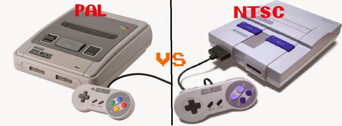
The SNES redesign was obviously not meant to be more extreme (that would be the TurboGrafx-16). It was designed to be more "adult", boxy like other consumer electronics, and more in line with NES.PS5 may be the winner, but the US SNES still offends me.
Someone thought the original design lacked in the radical department, so they made a more EXTREME version for the 'MERICA market. One of the ugly sins of the 90's along with renaming Megadrive to Genesis.
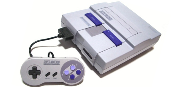
Sorry, but the best I can do is blame Nintendo of America's opinion of what a "grown up" console would look like. They ended up with something that looked like more of a toy than the superior design for Japan.Blame the American taste. Nintendo knew what they were doing.
PS5 may be the winner, but the US SNES still offends me.
Someone thought the original design lacked in the radical department, so they made a more EXTREME version for the 'MERICA market. One of the ugly sins of the 90's along with renaming Megadrive to Genesis.
I actually have this console complete in box lol.Obviously from a different era, but looks pretty cool imo.
Nah it’s one of the best and never understood the people who liked the fisher price looking rounded version better.PS5 may be the winner, but the US SNES still offends me.
Someone thought the original design lacked in the radical department, so they made a more EXTREME version for the 'MERICA market. One of the ugly sins of the 90's along with renaming Megadrive to Genesis.

Also nah, she's gorgeous and the Halo 4 version is PERFECTION.


That looks like some computer in the Nostromo starship from ALIEN, I like it.
That looks like some computer in the Nostromo starship from ALIEN, I like it.
Let's not forget how ugly the US version of the SNES is compared to the JP/EU one so here's a comparison.
Every US design was worse than PAL. All the logos and box art templates looked worse. The Game Boy Advance/32X/Game Gear/Sega CD US templates and logos looked worse. The Genesis logo and red template looked worse than the PAL Mega Drive, etc. I can't think of any example where the US logos/templates look better than in EU.
it doesnt sit flat without it?I never used the stand. That's for people who knock their shit over.
PS5. Love the console, hate the design.

What was offensive about the US SNES was how sleek the Japanese Super Famicom looked.PS5 may be the winner, but the US SNES still offends me.
Someone thought the original design lacked in the radical department, so they made a more EXTREME version for the 'MERICA market. One of the ugly sins of the 90's along with renaming Megadrive to Genesis.
So you prefer bland boxes?I mean it has to be the PS5 right? From a huge company like Sony, who has decades of design experience under their belt... Like why the fins? I don't need a fucking statement piece in my entertainment center. Just give me an inconspicuous black box, shit. By contrast the series x has a great design imo. Retro consoles were such goofy products of their time. I think looking rad was definitely a generational design choice.
Yes I thought I made that pretty obvious in my post.So you prefer bland boxes?
Let the games do the talking. The box just connects to the tv. It doesn’t need to be flashy. Certainly not something that is obnoxious and unsightly in my living room.Just give me an inconspicuous black box, shit.
Pictures don't do it justice but it's even
easily this wins ugliest console

it doesnt sit flat without it?
Sure, I tweaked mine a bit (new panels, sticker to hide the cheap shiny plastic, and different horizontal stands), but I think it looks pretty awesome.


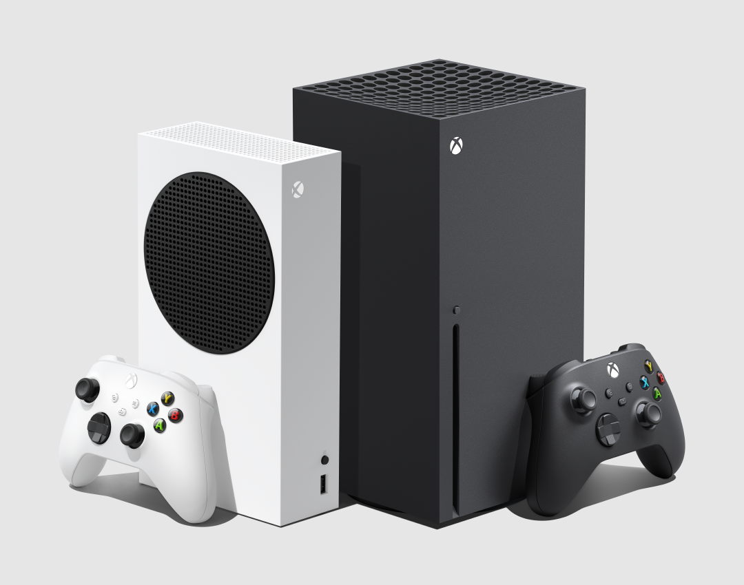
Have you seen the Virgin Media Hub 4?The SX is a sleek looking monolith, the PS5 looks like a wi-fi router that's taken one too many pills of HGH.

the xbox one is a non console to me. What a shit device. I think a lot of people including myself switched to pc gaming around that time.That's my choice as well.